In every new release, we are striving to introduce new features a recent release of Aspose.Cells Cloud 20.9, some new and very exciting features have been introduced so that our customers, make the best use of our APIs while working with Pivot Tables, Charts, and Sparklines within Excel files. Please be aware that you cannot only work with MS Excel files but can also create, update, and manipulate data inside OpenOffice files (ODS). This article focuses on steps to manipulate sparklines, charts, and pivot tables using REST API.
Sparklines Processing
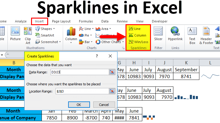
Sparklines are an amazing approach for displaying statistical data in a compact and more compelling approach and are usually drawn without axes or coordinates. They are used to showing trends in a series of values, such as seasonal increases or decreases, economic cycles, or to highlight maximum and minimum values. Usually, they are positioned near their data for the greatest impact, and also, if we do not have ample space to accommodate a chart, we make use of Sparklines for a better visual representation of data.
Owing to such importance, the capabilities to create and manipulate existing sparklines within an Excel worksheet have been provided.
Working with Pivot tables
A pivot table is an amazing way to store the summary of a certain data set in a condensed manner and also, helps the user to expand, isolate, sum, and group the particular data in real-time. The table helps in making a concise summary out of thousands of rows and columns of unorganized data and enables you to make precise and quick decisions.
Aspose.Cells Cloud is capable of programmatically dealing with pivot tables. The API is updated to empower the users for pivot tables manipulation in Excel worksheets. Therefore, in order to update the style of the pivot table, you need to use PostPivotTableStyle method.
cURL command
curl -X POST "https://api.aspose.cloud/v3.0/cells/Sample_Pivot_Table_Example.xls/worksheets/Sheet2/pivottables/0/FormatAll" -d '{"Font":{"Name":"Arial", "Size":10}}' -H "Content-Type: application/json" -H "Accept: application/json"
Go
Adding Charts to Excel worksheet
“Pictures express more than words”. Therefore, charts help in summarizing an entire table into an understandable fact. Also, we can charter Millions of data points quickly and results can be seen immediately. Moreover, it is really very tiring to understand data through large tables. Whereas, Charts allow your audience to see the meaning behind the number. Furthermore, in many cases, there are trends or insights that cannot be shown by simply looking at raw data. Aspose.Cells Cloud is fully capable of dealing with charts when it comes to retrieval, addition, update, removal, transformation. So you can easily manipulate Chart instances within an Excel worksheet.
You simply need to use PutWorksheetAddChart method to add a chart instance to the Excel worksheet.
cURL
curl -X PUT "https://api.aspose.cloud/v3.0/cells/myWorkbook.xlsx/worksheets/Sheet1/charts?chartType=Bar&area=B1:F2&title=SalesState" -H "Content-Type: application/json" -H "Accept: application/json"